Adding content to your Guide layout

After you create the shell of the new guide layout, add
Flash Builder components using the Flash Builder Source view. Use
the components that provide the behavior you are trying to achieve.
In addition, you can include other Guide and Flex components to
suit your specific needs.
In this example, the blank panel layout is extended to include
an area for displaying panel content. It also includes some navigation
buttons to move between panels and submit the Guide data.
Add the following to the blank panel layout:
-
A standard Flex component for organizing objects into
a vertical list. The padding settings provide a margin around the
Guide content:
<mx:VBox width="100%" height="100%">
        paddingTop="5" paddingBottom="5" paddingLeft="5" paddingRight="5">
Note:
Alternatively,
you can create margins using the setting and value
styleName="guide"
.
This method derives the margins from the CSS values.
-
The region of the Guide layout for displaying the current
data entry panel and the associated layout:
<gc:PanelContent width="100%" height="100%" />
-
A standard Flex component for organizing objects into a horizontal
list:
<mx:HBox>
-
A button object that goes to the previous panel in the Guide.
This object is inactive if the current panel is the first panel
in the Guide. The
label
attribute controls the
button caption text:
<gc:PreviousPanelButton id="previous" label="{'Back'}"/>
Note:
The
curly brackets and single quotation mark that enclose the button
text prevent the component from using resource strings. This text
is applied after the component is initialized.
-
A button object that goes to the next panel in the Guide.
This object is inactive if the current panel is the last panel in
the Guide:
<gc:NextPanelButton id="next" label="{'Forward'}"/>
-
A button object that submits the Guide data. This object
is inactive if the current panel is not the last panel in the Guide:
<gc:SubmitButton label="{'Submit Data'}"/>
Note:
Specifying a value for the
label
attribute overwrites the default SubmitButton labels. The default SubmitButton labels are added based on the submission option selected in the Guide Design perspective of Workbench.
The
SubmitButton component behaves differently depending on the submission
options the Guide author sets for the Guide in the Guide Design perspective
of Workbench. The following table outlines the behavior of the SubmitButton
component for each submission option:
|
Submit option
|
SubmitButton behavior
|
Default SubmitButton label
|
|
Guide (Default)
|
Users must submit the data by clicking the
submit button on the Guide.
|
Submit
|
|
Interactive PDF
|
Clicking the submit button opens the interactive
PDF form from which the form filler submits the data by clicking
the appropriate submit button.
This option is available when
the Guide is based on an XDP form that includes an interactive PDF
form. When you select this option, a Submit From PDF button appears
in the navigation button area. Clicking this button switches the
view to the interactive PDF document, which must include a Submit
button. The Submit From PDF button appears in all environments where
the Guide can run, such as Adobe® LiveCycle® Workspace 9 or a browser.
No other submit button appears in the navigation button area of the
Guide or in the Workspace chrome.
|
Submit from PDF
|
|
User Button
|
Submits the data from a button that you
add to a panel in the Guide. This submit button appears in all environments where
the Guide can run. No other submit button appears in the navigation
button area of the Guide or in the Workspace chrome.
|
N/A
|
|
Host
|
The SubmitButton component does not appear
on the Guide. The hosted application, such as Workspace, must extract
the data from the Guide and perform the data submission.
|
N/A
|
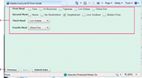
Your MXML source looks like the following snippet and illustration.
<?xml version="1.0" encoding="utf-8"?>
<gc:Wrapper width="100%" height="100%"
    xmlns:mx="http://www.adobe.com/2006/mxml"
    xmlns:gc="ga.controls.*" >

    <mx:VBox width="100%" height="100%">
            paddingTop="5" paddingBottom="5" paddingLeft="5" paddingRight="5">
        <gc:PanelContent width="100%" height="100%" />
        <mx:HBox>
            <gc:PreviousPanelButton id="previous" label="{'Back'}"/>
            <gc:NextPanelButton id="next" label="{'Forward'}"/>
            <gc:SubmitButton id="submit" label="{'Submit Data'}"/>
        </mx:HBox>
    </mx:VBox>
</gc:Wrapper>
Ensure the Flex library project builds with no warnings or errors.
You can now move on to
Referencing your Flex library project in Workbench
.

