Overview of panel layouts

In general, a panel layout consists of components that
act as placeholders for text, objects, or Guide extensions specified
in the Guide Design perspective of Workbench. The following are
the most common Guide placeholder components that appear on panel
layouts:
-
PanelItem:
-
A placeholder object that displays an item, or a repeating
sequence of items, from the Guide tree; either a field, text object,
or button.
-
PanelText:
-
Corresponds to the Guide Text object in the Guide Design perspective
in Workbench. Each
PanelText
object is contained
within a
PanelItem
.
-
PanelTitle:
-
A placeholder object that displays the name of the current
panel. The panel title is specified in the Guide Design perspective
in Workbench.
-
HelpPanel:
-
Displays panel help text to a form filler. The panel help
text is specified in the Guide Design perspective in Workbench.
The
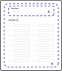
following image illustrates one example of how a panel layout structure reflects
the common placeholder components.
View full size graphic

-
A.
-
Panel help text (HelpPanel) that a Guide author enters
using theGuide Design perspective in Workbench. Depending on the
Guide layout, the panel Help can appear as part of the panel. I
can also appear with the Guide Help text in the Help Center area
of the Guide layout.
-
B.
-
Panel content that consists of Guide objects (PanelItem)
as well as Flex components.
-
C.
-
Panel title text (PanelTitle) for the panel that a
form author enters using the Guide Design perspective in Workbench.
The
MXML source code for the panel layouts included with Workbench are available
in the LiveCycle_ES_SDK\misc\Guides\code\src\ga\layouts folder where
Workbench is installed. By default, the folder is C:\Program Files\Adobe\Adobe
LiveCycle Workbench ES2\LiveCycle_ES_SDK\misc\Guides\code\src\ga\layouts.
For
example, examine the MXML source for the One Column panel layout:
<?xml version="1.0" encoding="utf-8"?>
<ga:LayoutTemplate width="100%" height="100%"
    xmlns:mx="http://www.adobe.com/2006/mxml"
    xmlns:ga="ga.model.*"
    xmlns:gc="ga.controls.*">

    <mx:Metadata>
        [IconFile("assets/GuideComponentDisabled.png")]
    </mx:Metadata>

    <mx:Script>
        <![CDATA[
            import mx.core.UIComponentDescriptor;
            import ga.controls.Wrapper;

            override public function get documentDescriptor(  ):UIComponentDescriptor { return Object(this)._documentDescriptor_; }
            override public function set documentDescriptor( oDescriptor:UIComponentDescriptor ):void { Object(this)._documentDescriptor_ = oDescriptor; }
        ]]>
    </mx:Script>

    <mx:VBox width="100%" height="100%" styleName="layoutobjects">
        <gc:HelpPanel id="helpPanel" styleName="panelhelp" />
        <ga:PanelItem  itemInstancesPerCycle="-1" repeatItemLimit="-1"  width="100%"/>
    </mx:VBox>

</ga:LayoutTemplate>
The MXML code is distributed
into the following sections:
-
Initial namespace definitions.
Namespaces are a convenient way to define shortcuts to ActionScript
packages to simplify your code. Although not required, they are
recommended.
-
<mx:Metadata>
This MXML block
defines an icon image to display in the Components view of Flash
Builder.
-
<mx:Script>
The One Column
panel layout is an MXML component, and it is created declaratively
in MXML. Panel layouts created declaratively require this
<mx:Script>
block
to display form design objects.
-
<gc:HelpPanel>
and
<ga:PanelItem>
Placeholder
components for the panel help and Guide objects respectively. Each
of these components is discussed in more detail later, but understanding
PanelItem
is
critical for creating custom panel layouts.
